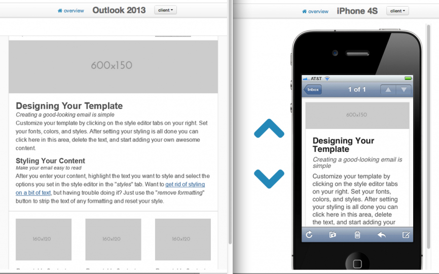
Email marketing consists of much more than just sending an email newsletter.
While most business owners focus on their email newsletter, and invest in a custom, branded email template design — they forget about the many other types of email marketing messages they will need to send and then end up scrambling at the last minute to create something in alignment with their overall brand.
When working with our email designers, consider having them create branded templates for:
- Default “signature templates” for regular email correspondence
- Solo email blasts
- Special announcements
- Media releases
- Special promotions and offers
- Auto responders and follow up sequences
Once you have a professional email marketing template designed for your business, the next step is to focus on the design and formatting of your content. If your content appears unprofessional, contains broken links or missing images, or doesn’t effectively use margins or spacing, you could be sending email messages no one wants to read! And trust me, no one is going to ask you to resend your newsletter. They are just going to hit delete or unsubscribe.

Quality email content formatting increases content consumption, click-throughs, and forwards.
Here are some simple email design tips and content formatting tips to consider when sending emails to help make your emails easier and more enjoyable to read:
- NEVER USE Microsoft Word to write your email content. Use a text editor like NOTEPAD or similar program.
- Newspaper layout rules apply. To make it easier for readers to absorb your information and perceive your email as a faster read, break content up into several 1-3 sentence paragraphs and keep the sentence length to 15 words or less per a line.
- Use bulleted and numbered lists. If your readers are in a hurry, they will scan your through your ezine first to see if anything looks interesting. In many cases they will stop to read bulleted lists. Get them hooked with a simple, quality, interesting list.
- Keep content away from template and email client edges. Not only is it ugly to have your content touching the border of your email template, it also screams, “I don’t know what I’m doing!” Plus, subconsciously your content will be more difficult to read because the text running into the border lines or edges will be visually distracting. It’s just unprofessional looking.
- Use color wisely. Create a color palette for your ezine (based on your brand) and stick to it. Don’t go adding weird colors all willy-nilly just because you can.Use color to guide your readers through your ezine and to call attention to important elements like headlines, sub headlines, and calls to action.
- Add ALT tags (alternate tags) to your images. Alt tags are pieces of HTML attached to an image that describes what the images is. When images are turned off in email clients like Microsoft Outlook, he ALT text will be displayed in place of the image. This is critical especially if your ezine or email blast uses an image header.
- Add HTML titles to your images and links. Each image and link can also be assigned an HTML title. Adding an HTML title adds more scannable content for the email filters and bots, and can help your email marketing messages avoid getting caught in spam filters.
- Beware the “right click to download” warning. Make sure you know what your email looks like when images are turned off. Is important content missing? Can subscribers still tell that it is from you or your company? Consider keeping all information at the very top of your template HTML so even if images are turned off, your template still displays properly and reflects your brand.
- Understand the proper ratio of text to images. Reduce chances of getting caught in spam filters by making sure you have more text than images in your newsletter or broadcast. At First Direct Corp. we strive for a 70/30 split, with 70% (or more) of the content as text, and 30% (or less) of the content as images.
- Use a consistent design and format. Design your template and stick with it. Only slight updates should be done over time to keep your email marketing design current and to refine your layout. Constantly changing your template design will confuse readers and compromise the brand recognition you are building — and brand recognition is one of the keys to achieving high open rates.
- Always include your contact information. It’s the law that your complete contact information, including your mailing address be visible in all of your email marketing communications — especially in email messages that sell products, programs, events, or services. Plus it’s smart to make it easy for your subscribers to be able to contact you.
- Choose your fonts wisely. Remember that every computer is different and has slightly different fonts available. Make sure that the fonts you use are standard fonts available on all machines. If you’re not HTML/tech/font savvy, consider sticking to fonts such as Arial, Courier, Verdana, Times, and Georgia. Just because your machine has the font, doesn’t mean all your email recipients will.
- Make your type big. With more and more high resolution devices hitting the market, it is becoming more important than ever to increase the font size in your communications — and that goes for more than your website. Don’t make your audience squint to read your emails on their phones! Use 16pt. at minimum, but consider going with 18pt or even 20pt.
- Keep it simple. The more complicated your email newsletter design, the more work it is going to be to produce each issue — and the more chances there are for something to go wrong.

Request more info:

